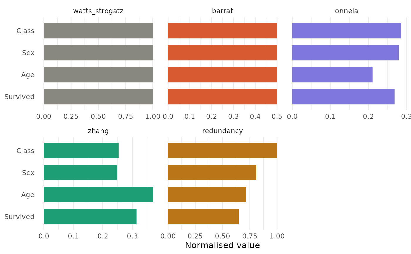
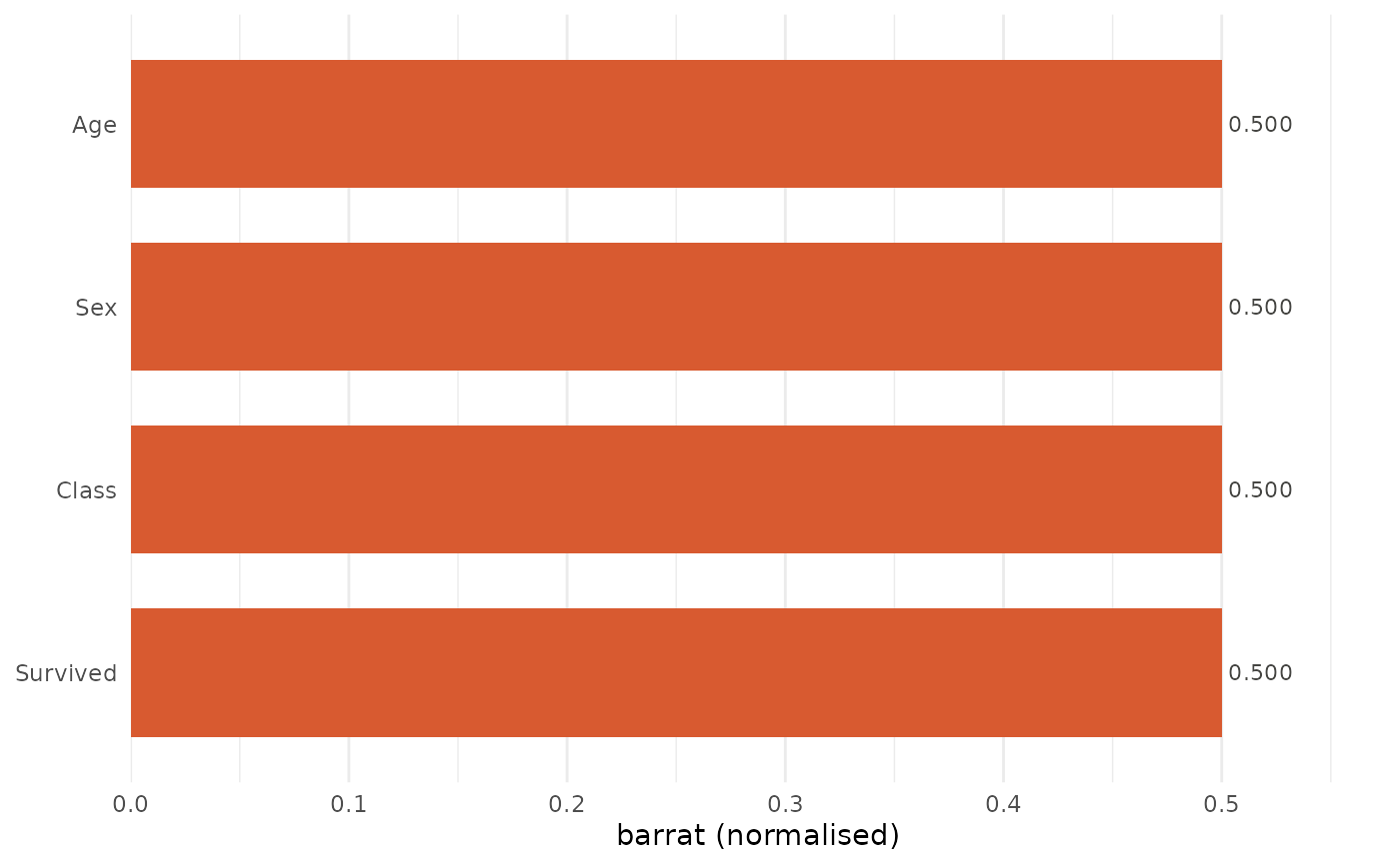
Produces a bar chart (single method) or a grouped/faceted comparison chart (multiple methods) of clustering coefficients.
Usage
plot_clustering(
  x,
  method = "barrat",
  normalize = TRUE,
  title = NULL,
  engine = c("ggplot2", "base")
)Examples
df <- expand_table(Titanic)
cg <- catgraph(df)
plot_clustering(cg)

plot_clustering(cg, method = "all")